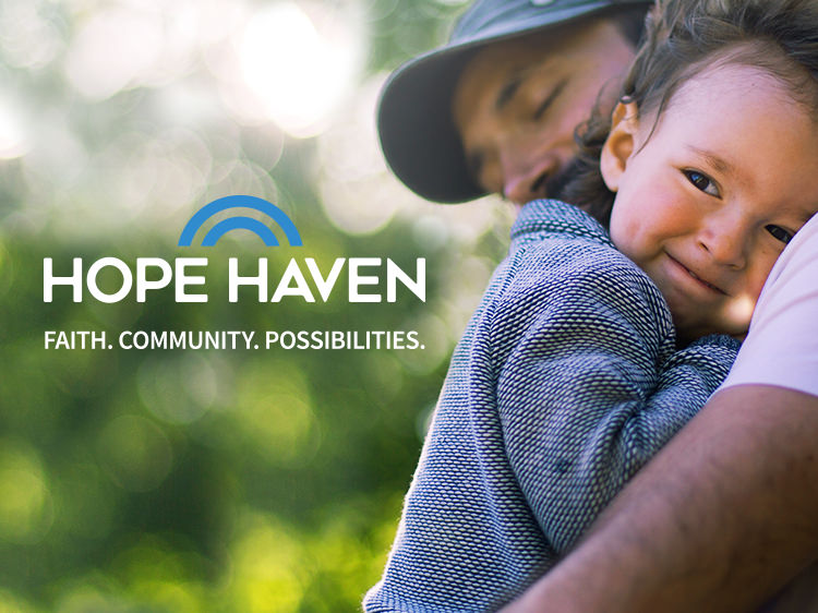

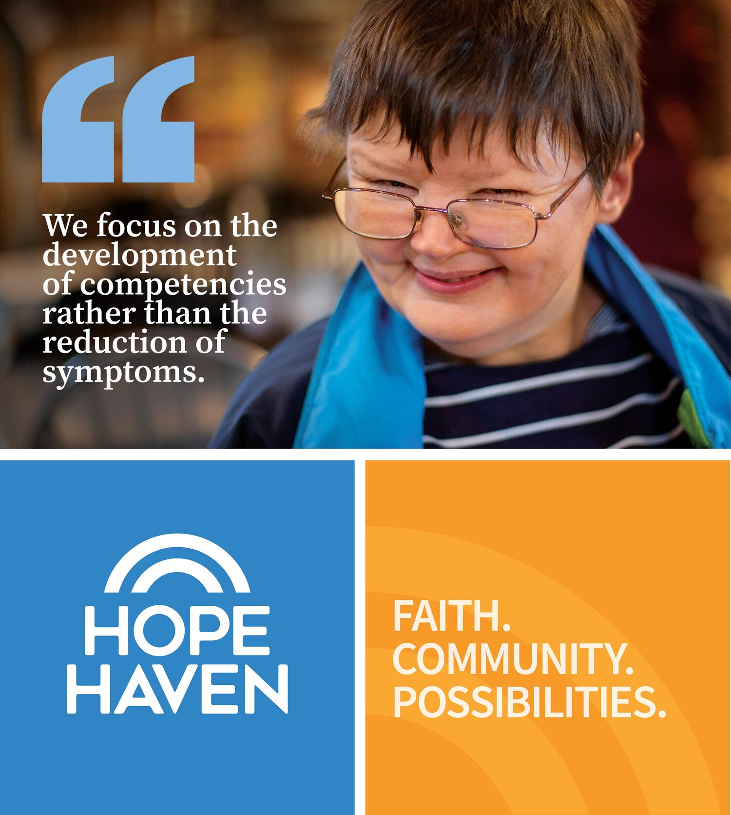
The tagline empowers the nonprofit by highlighting its roots in faith, building community, and inspiring others.
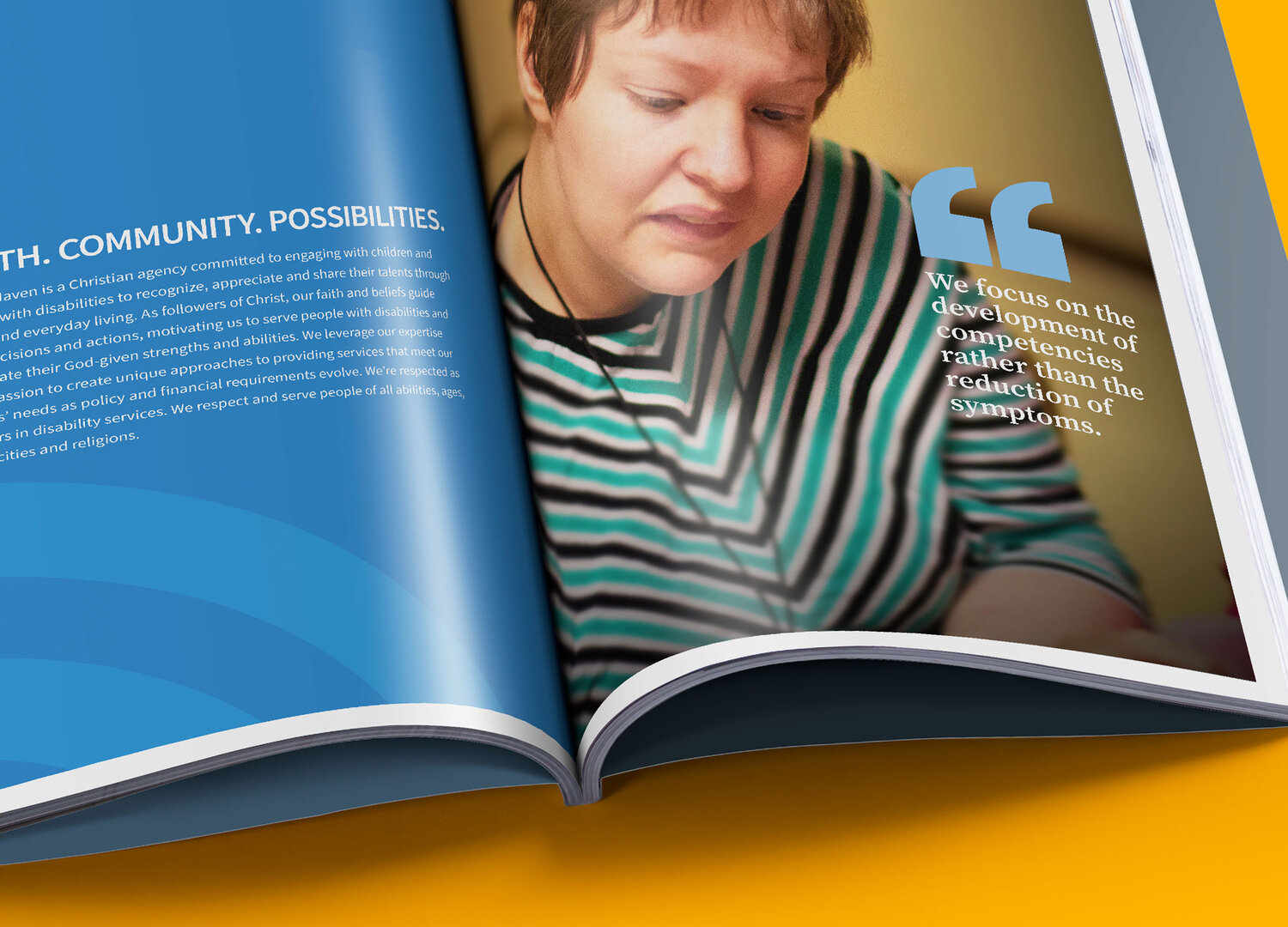
The Hope Haven identity system is bright and colorful, evoking the nonprofit’s focus on uplifting the people with whom they interact.
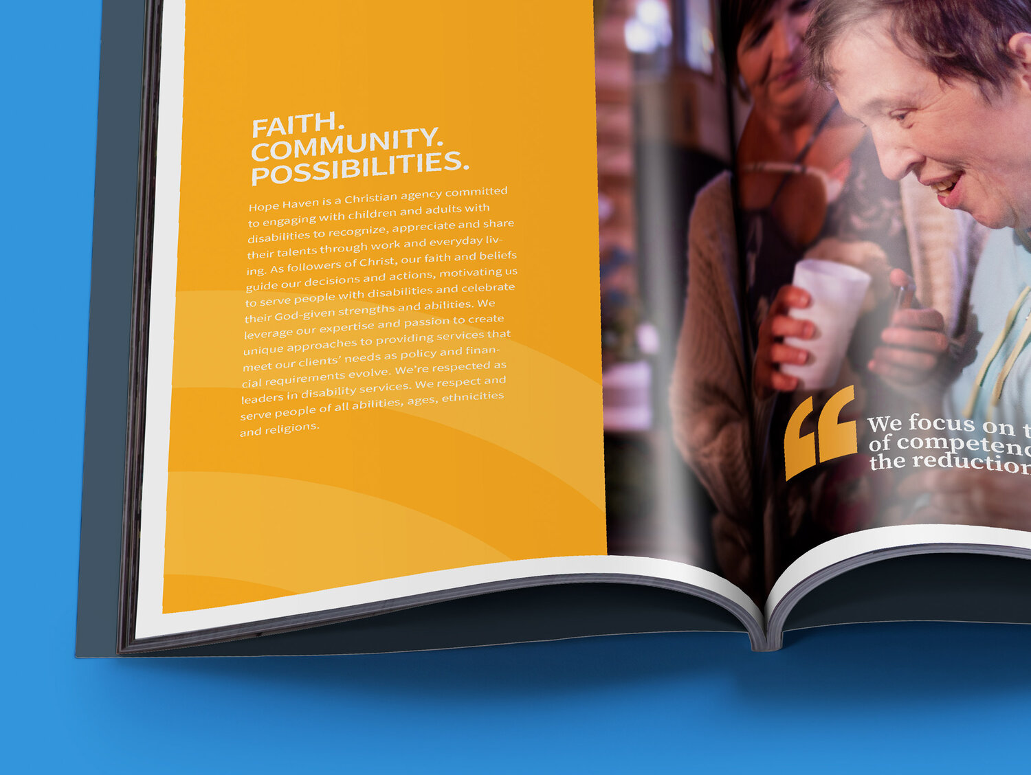
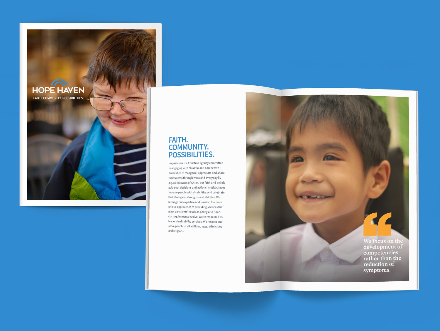
The power of the visual identity system is simplicity—it showcases the connections between caregivers and those who are served, letting their stories shine through.
Our new brand identity positions Hope Haven as the progressive leader that it is in disability services through a contemporary and unified experience across all communications.”
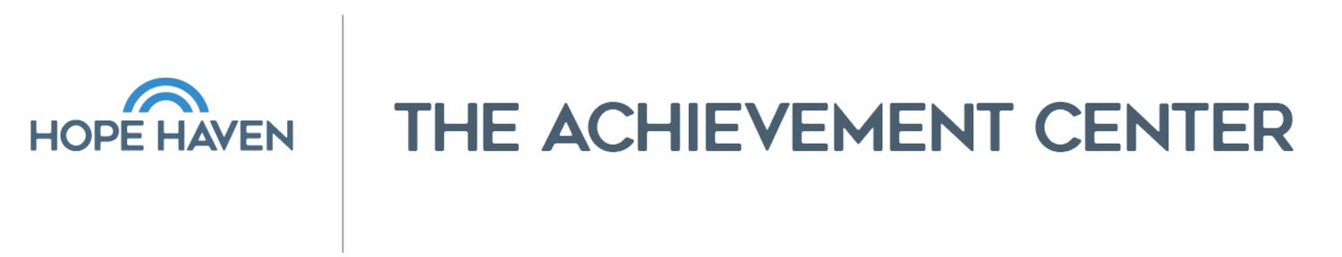
A simple brand endorsement system helps connect acquired companies with the Hope Haven brand.