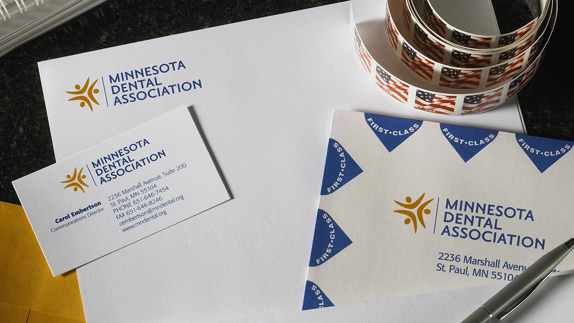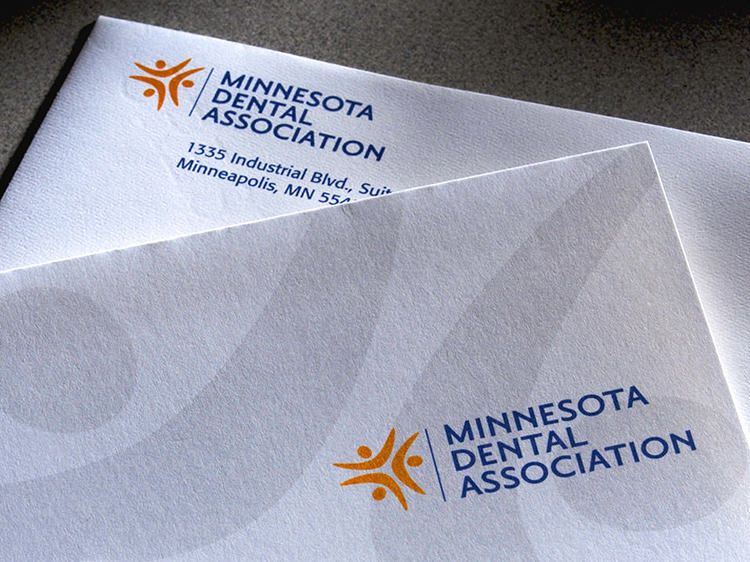
The Solution Developing a clear, thoughtful brand strategy was a critical first step in the process—as was discouraging the use of an acronym in place of the organization’s name. The logo pairs an elegant mark symbolizing people smiling together with classic typography. This contemporary, professional identity appropriately positions the organization in the dental care industry.


