Alamotape Brand Identity

A brand new look for a San Antonio-based manufacturer of high-performance adhesive tape.

Alamotape isn’t just any tape company. Its point of difference is its high-touch, responsive approach to developing high-quality structural adhesive tapes. Previously FLEXcon Industrial, the new name expresses their deep connection to their location in San Antonio as well as a sense of determination that is at the heart of both the history of the Alamo and the people behind Alamotape. The logo, inspired by the iconic visual of the Alamo, also suggests the nature of the product and its usage.

As we worked through design options for the logo, it became clear that if Alamo is in the name then “the Alamo” facade that is so well known needs to be front and center in the logo. The secondary graphic pattern further reinforces the tape roll concept through simple circular shapes with gradients from metallic-looking gold to black.

Website

Brand Architecture

Brand Strategy

Communications

Digital

Identity

Logo Design

Messaging

quotation mark graphic

The distinctive logo and visual identity has enabled us to gain notice within the community and our industry. This could not have happened without your team’s magic.

Dave Rosen, President, Alamotape

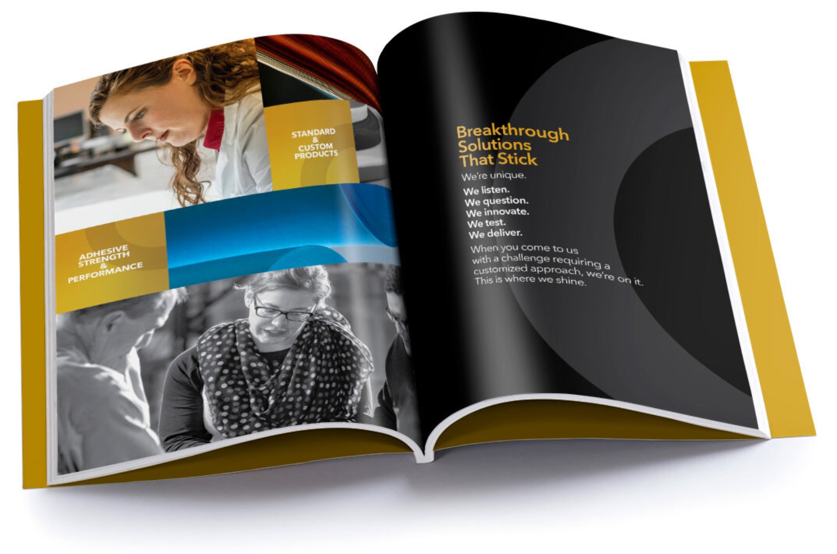
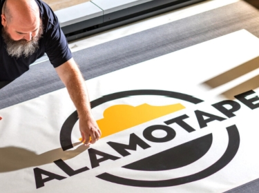
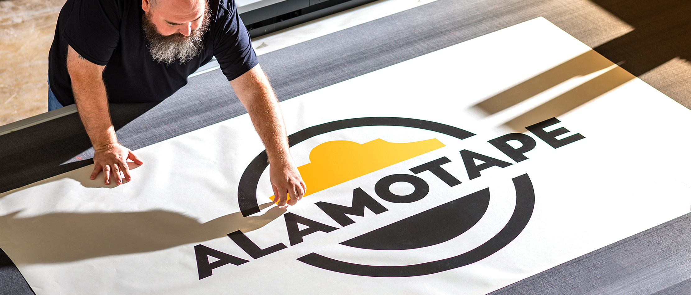
Imagery tells the story of how Alamotape employees work together to create custom solutions for their clients.

decorative color bar

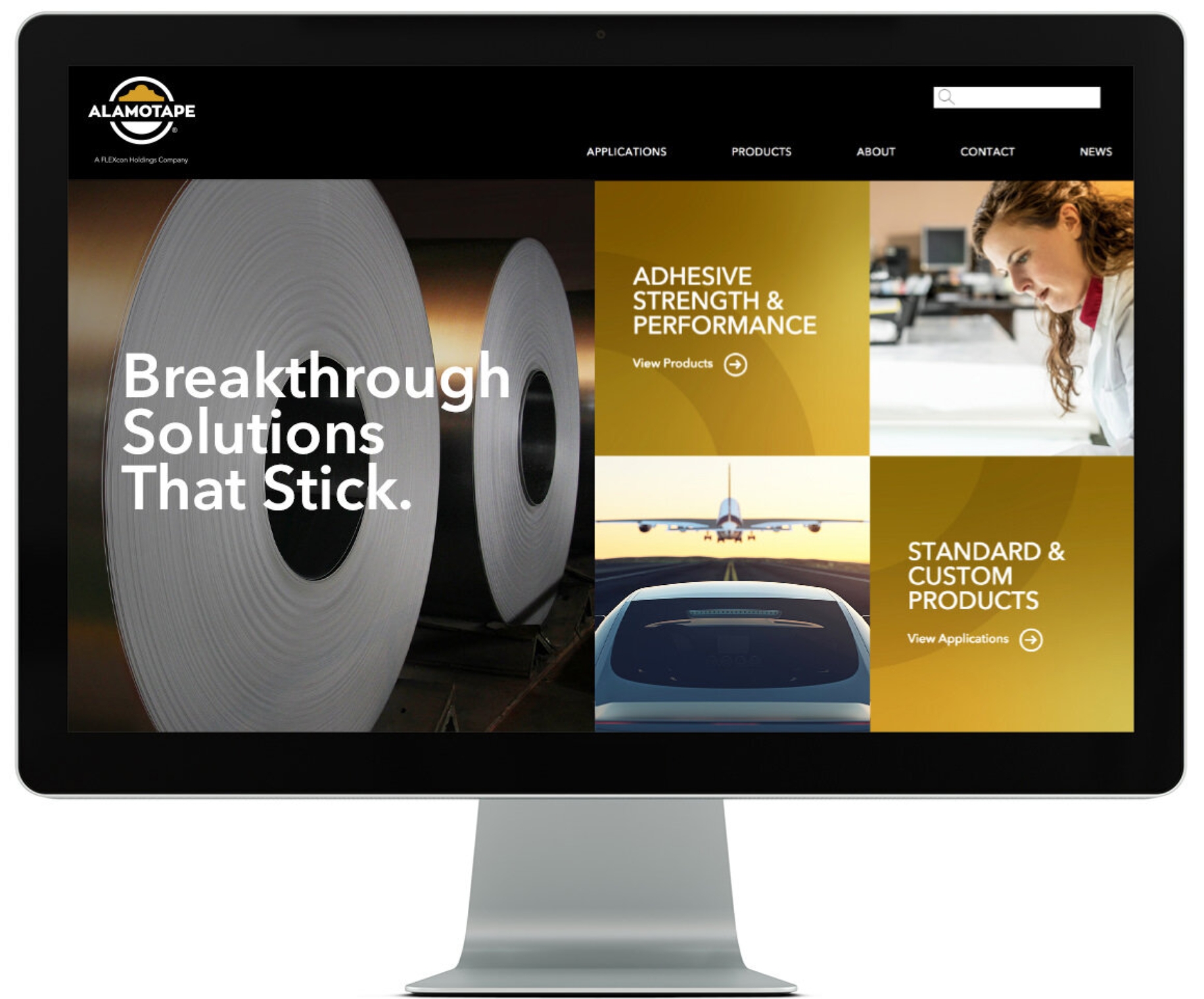
The system was designed to be consistent, yet flexible, allowing easy adaptation across multiple formats.

This site uses cookies to enhance your experience.Privacy Policy.