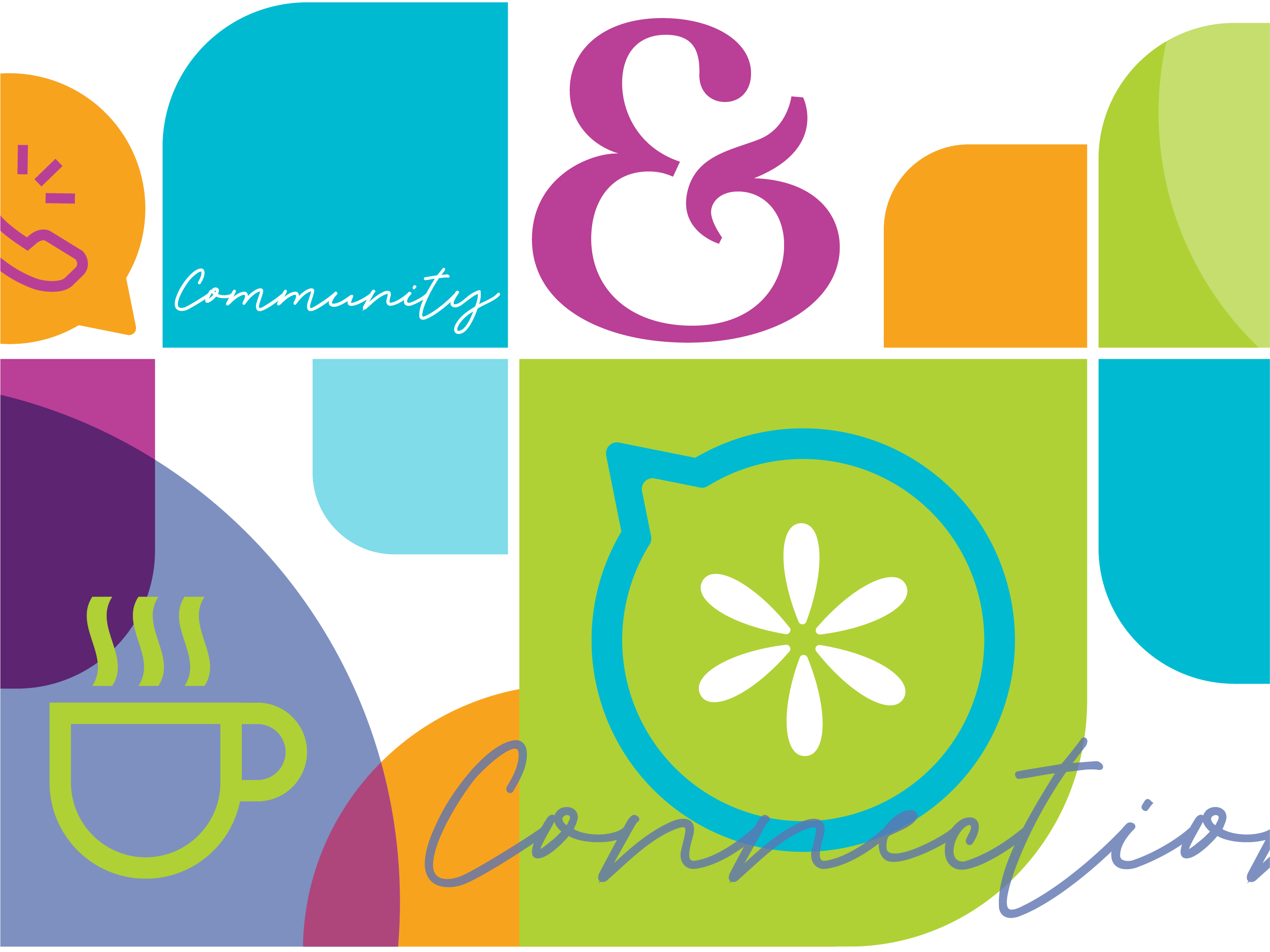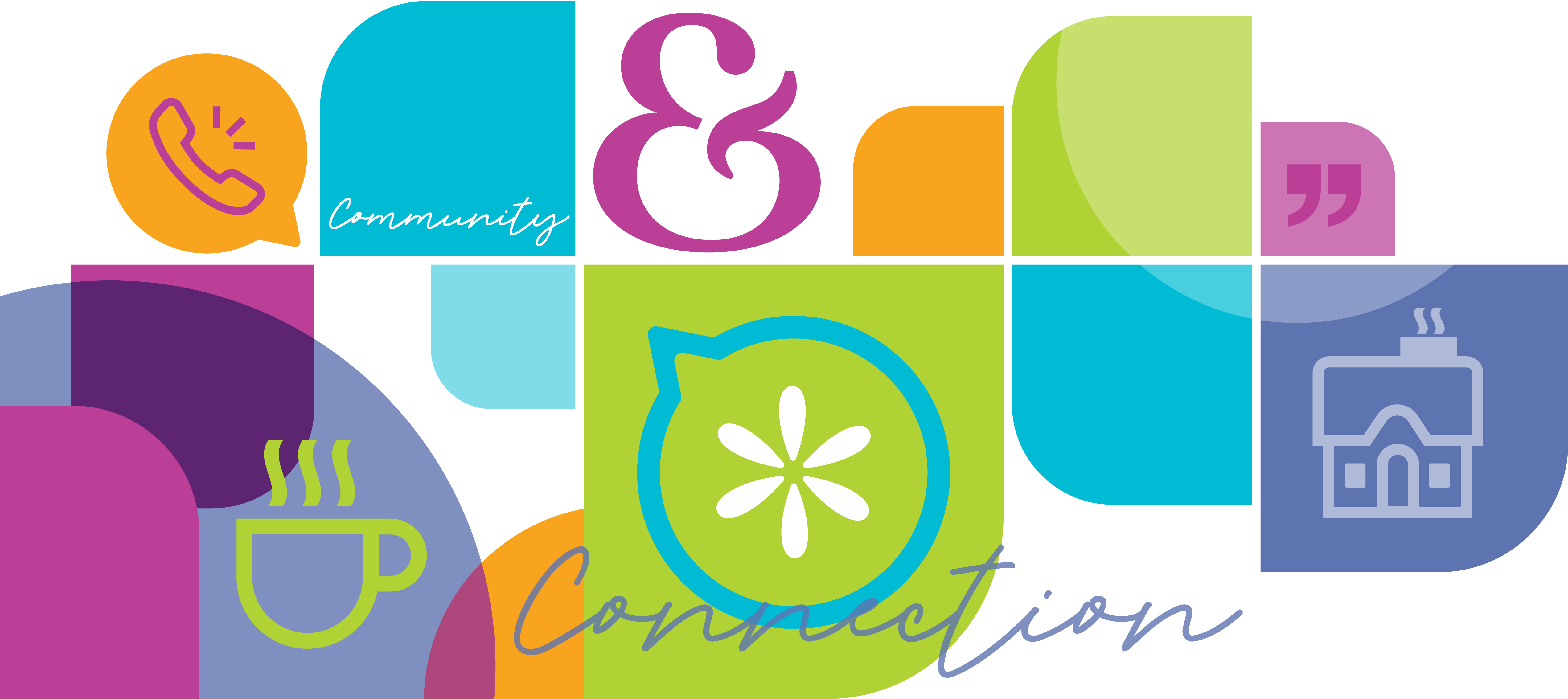
The new name and logo are approachable, simple and clear. When combined with the visual elements, the color palette reflects the vibrancy and joy of the organization.
Rebranding built on a strong brand strategy.
The new brand name and brand identity better reflect the organization’s purpose, mission and values, helping them more effectively reach and serve their target audience. The brand strategy includes the brand positioning, personality, messaging and tagline.
The design solution was derived from our extensive research which included a brand and competitive audit as well conducting focus groups with key stakeholders.
"Our new Friends & Co name and brand identity are more welcoming and inclusive for our target audience.”
James Falvey, Friends & Co, Executive DirectorDesigned to improve brand perception and brand recognition.
The visual identity system was designed to be more approachable and engaging for older adults as well as volunteers, donors and community members. An unexpected interplay of shapes, colors, and photos helps to build a strong brand identity while conveying the organization’s compassionate nature and focus on creating meaningful connections.
The combination of all brand identity elements — logo, color palette, icons, typography, graphic pattern and messaging — work together to create a distinctive brand identity that differentiates the organization from the competition while expressing its unique story and brand personality.





A series of shapes and icons are the key components of the visual identity.

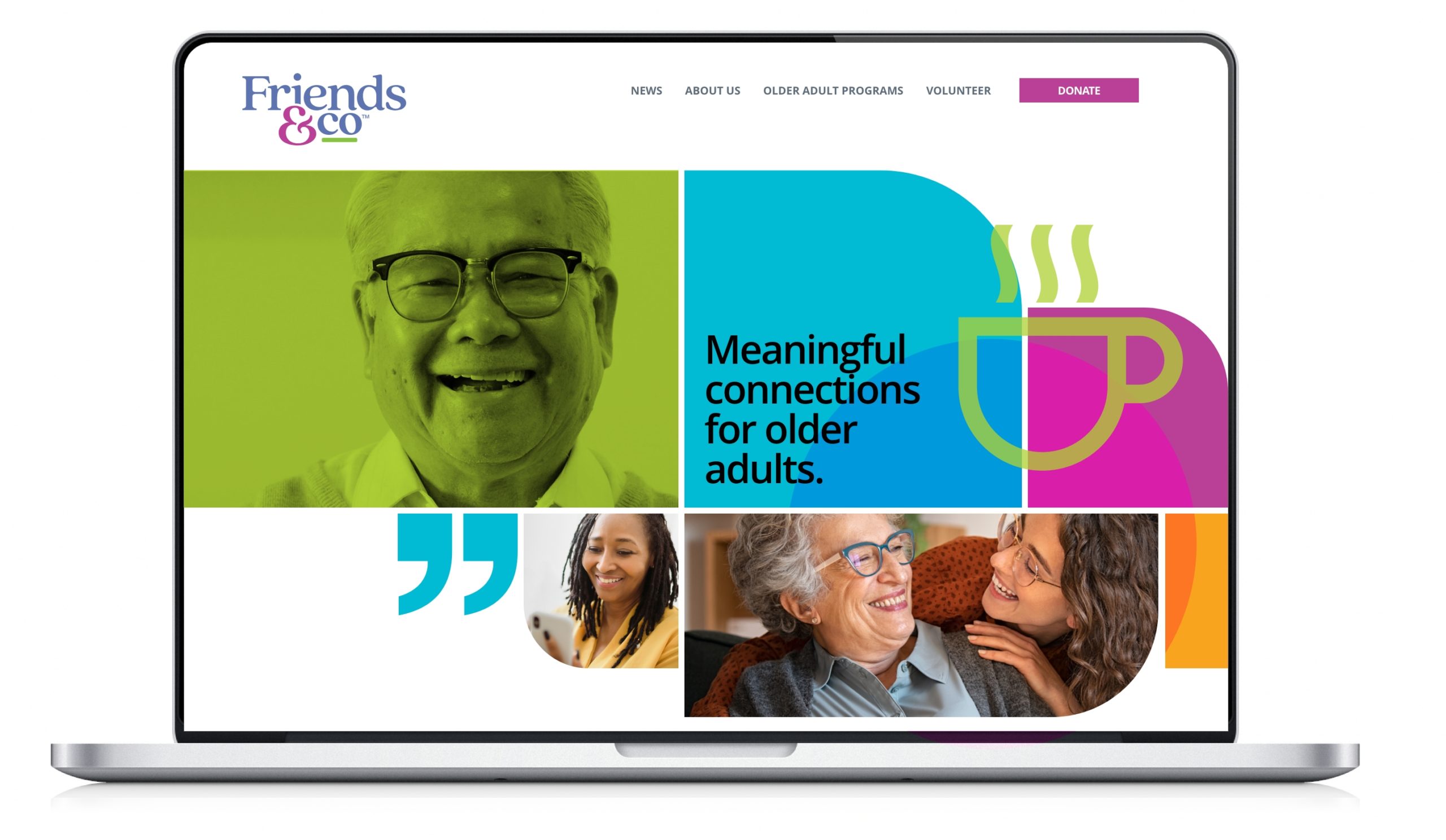
The website concepts ensure the brand identity connects various members of the target audience with Friends & Co in a way that resonates with their journey.
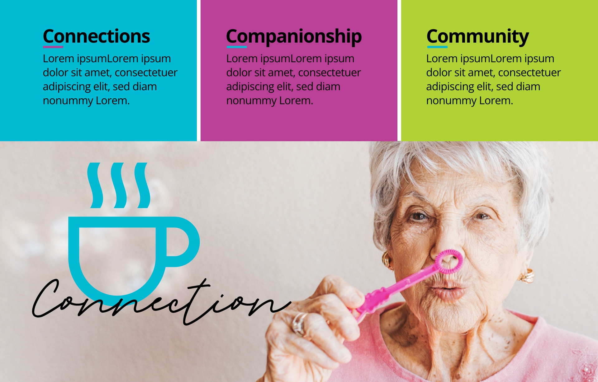
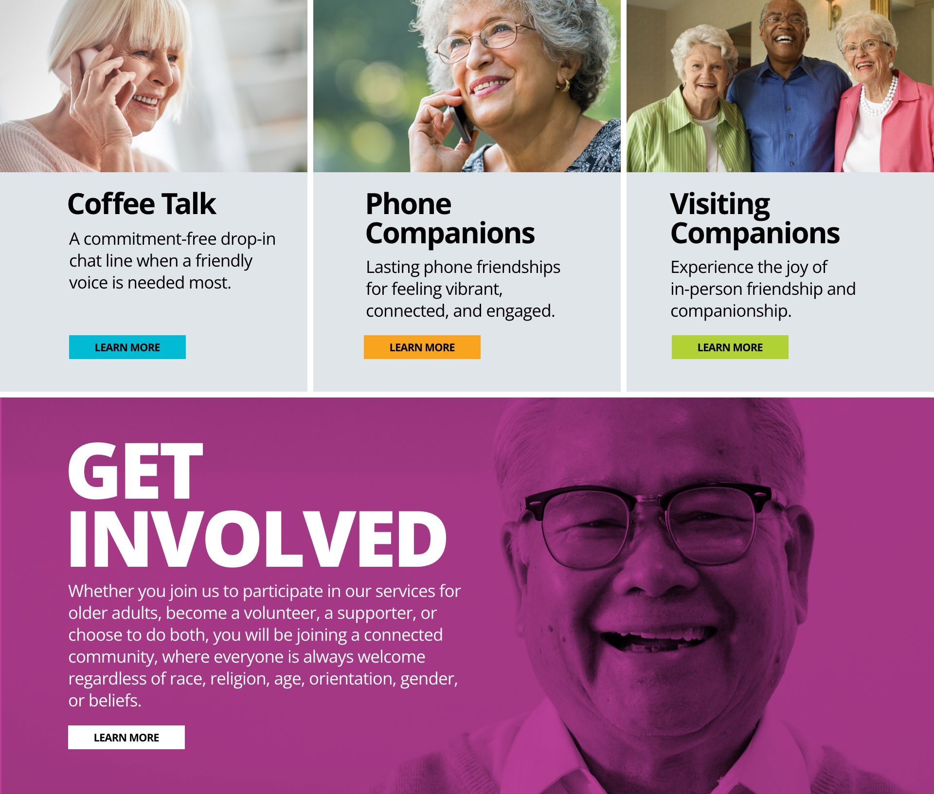
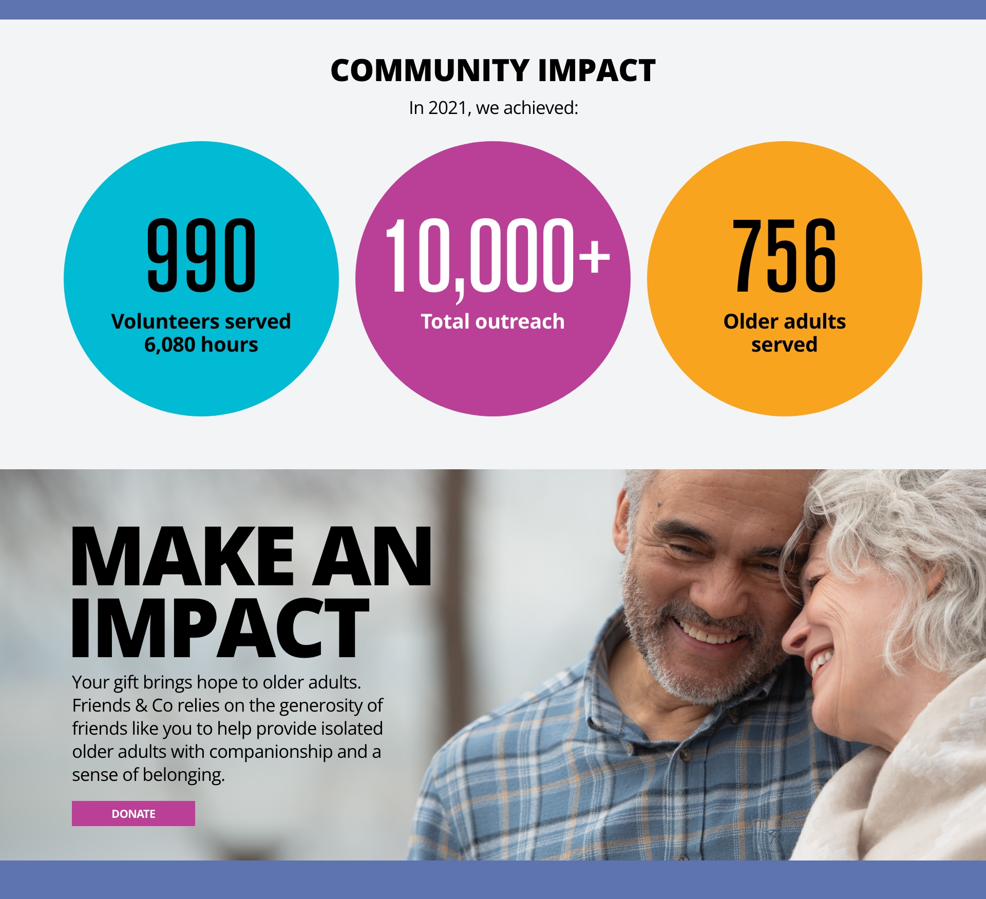
Brand style guide ensures successful brand implementation.
A comprehensive set of brand guidelines enables the consistent expression of the brand identity across all communications — from social media and website to events, wall graphics and printed marketing materials. Going far beyond logo, fonts and design elements, the guidelines offer direction around key messages and storytelling, helping to build a strong brand presence from launch day, forward.
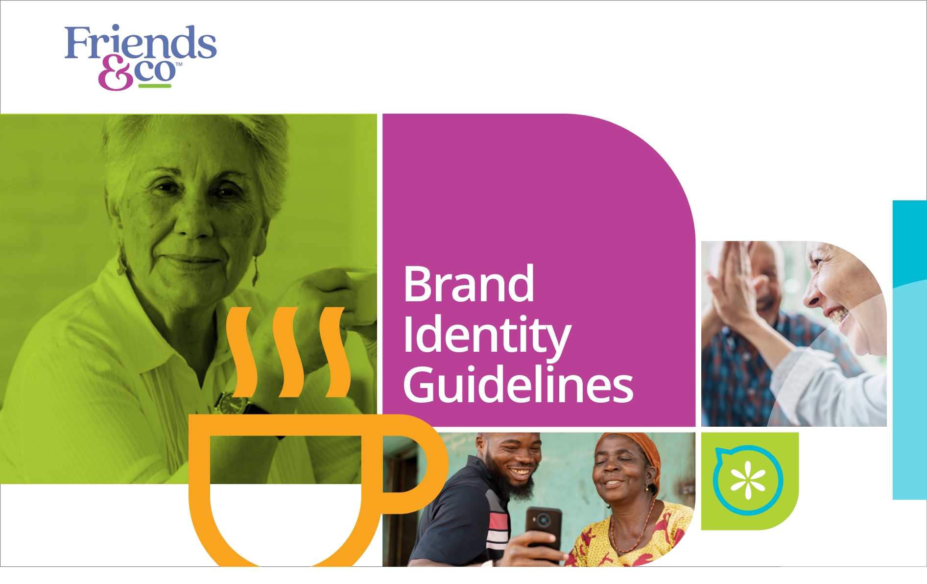
We created brand guidelines that offer an overview of the visual identity system and how to use the various elements. Templates are available so everyday tasks such as creating social posts and announcements is very straightforward,- making it easy for everyone stay on brand.
Engaging photography ensures emotional connections.
One of the key elements in developing any new brand identity is photographic imagery. For the Friends & Co rebranding, we defined the photographic style to ensure the brand personality is consistently conveyed in all marketing materials.

