Golden Harvest

Enriching a seed brand to stand out in its field.

Golden Harvest® is a corn and soybean brand known and loved by generations of farmers, but awareness was low and market share wasn’t meeting the company’s business goals. They turned to Franke+Fiorella to help revitalize the brand, yielding a bolder, more differentiating brand experience. We worked closely with Golden Harvest to strengthen its position as a local seed brand, grounded in genetics, agronomy and service—an alternative to the “big guys.” The Golden Harvest logo was retained but we created a more distinctive and consistent visual identity system for it to live within. We leveraged the existing orange color palette in a ‘word art’ graphic that enables Golden Harvest to subtly convey an additional level of messaging to their audiences.

Packaging

Messaging

Brand Strategy

Identity

Digital

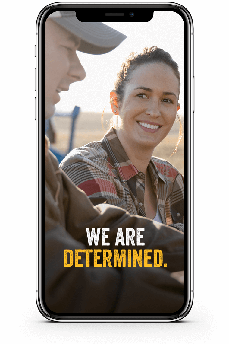
Animation was created for use in digital media.

decorative color bar

The identity is brought to life through visual animation and video using motion graphics, testimonials and footage of seed advisors working closely with farm families.

decorative color bar

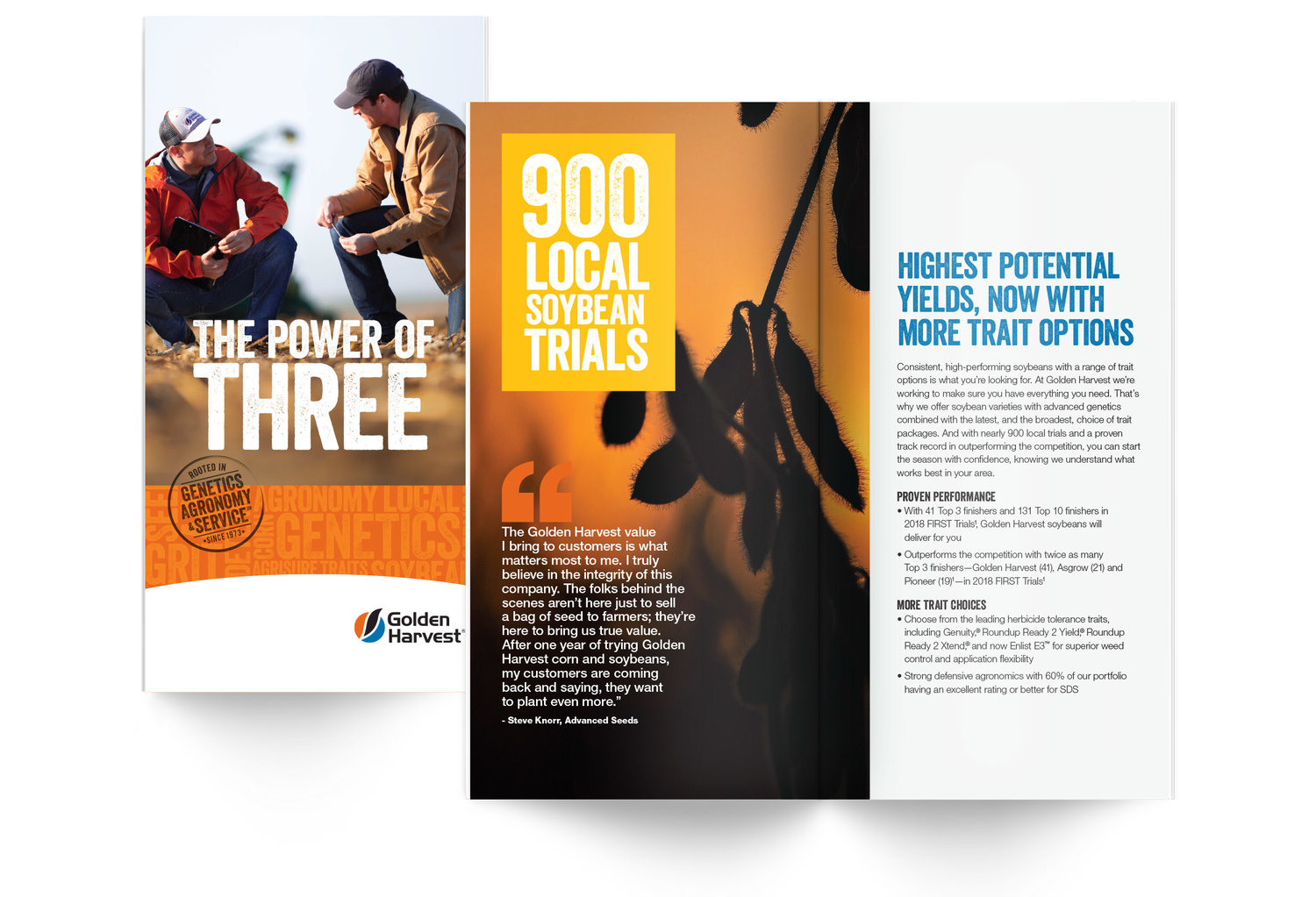
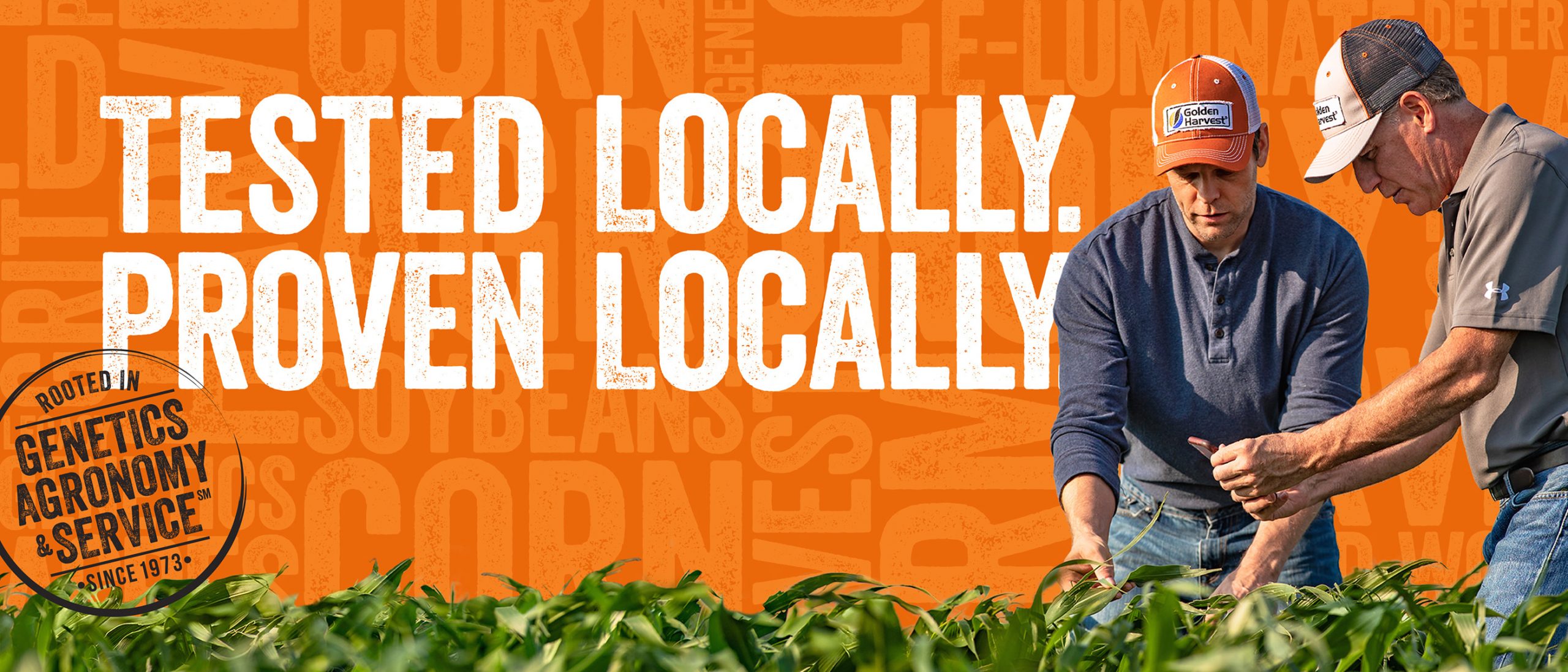
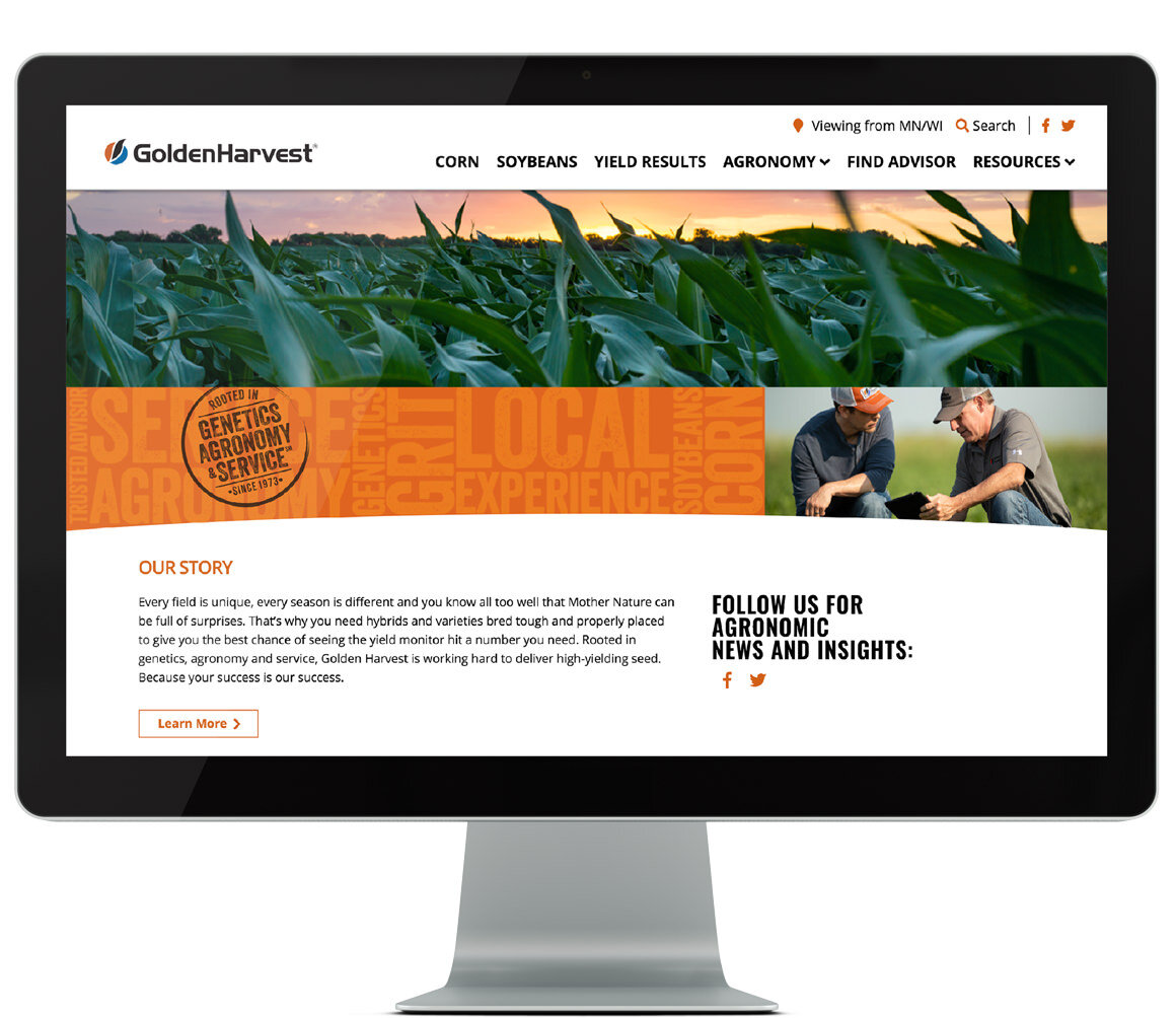
To ensure a consistent brand expression at launch, we created supporting elements including a brand brochure, digital brand reference tool, web banner design, print and digital advertising.

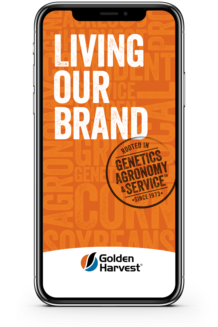
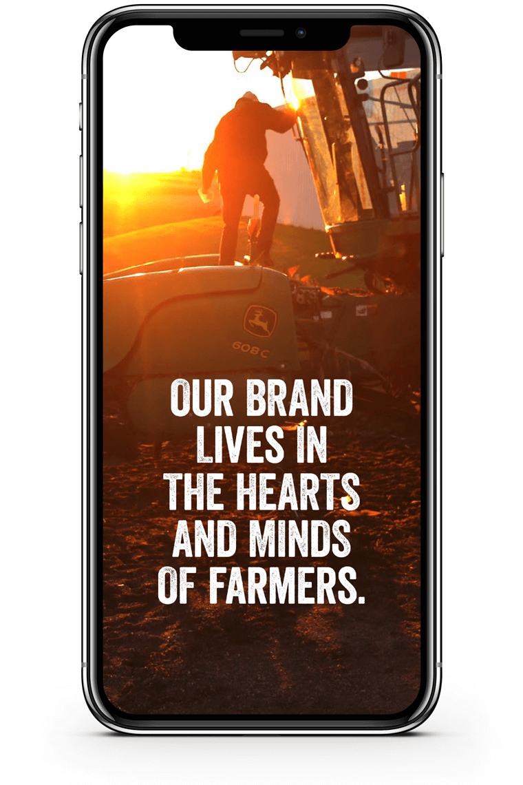
Living Our Brand is a guide shared via mobile to help employees stay on brand and cultivate pride in their work.

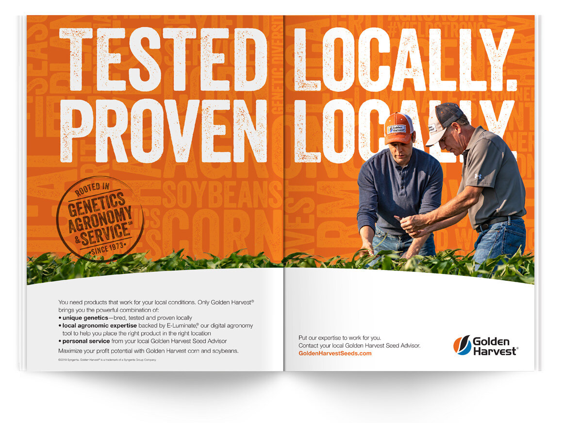
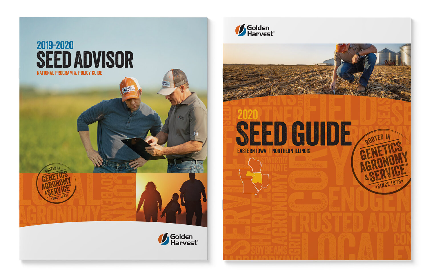
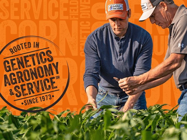
The new look of Golden Harvest makes it stand out against the competition.

This site uses cookies to enhance your experience.Privacy Policy.