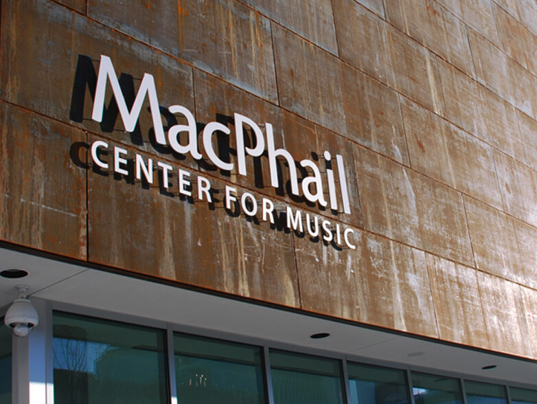
The Solution Franke+Fiorella designed the logo and visual identity system to reflect the organization’s passion, enthusiasm, approachability and commitment to excellence. A key component of the identity is a whimsical pattern of musical instruments that is applied across all communications.

The Result MacPhail Center for Music continues to thrive, even in a volatile economy. And the fact that a local musician chose to tattoo the instrument pattern on her arm is a testimony to the emotional response it evokes.
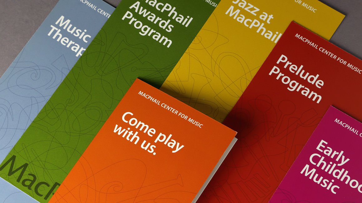
Quite an ensemble. A literature system highlights each of MacPhail’s core focus areas.
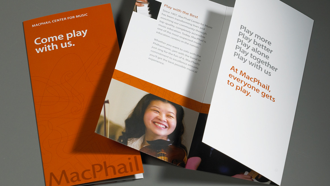
Play on. With a passion for play, MacPhail’s brochure positions the organization as a place where all are welcome to create sweet music.
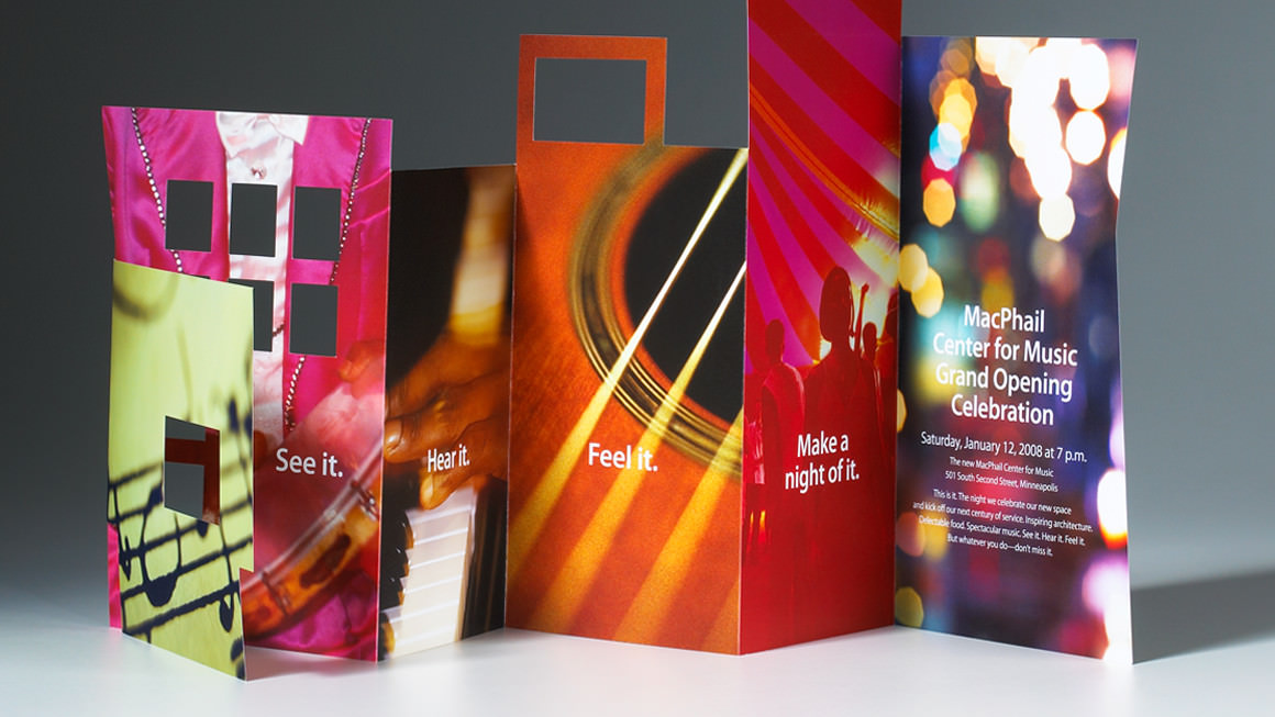
An unforgettable event. MacPhail’s grand opening gala invitation foreshadowed it—this was an event not to be missed. A flagship piece for the entire grand opening festivities, the invitation emulated the building itself while featuring colorful, festive party imagery.
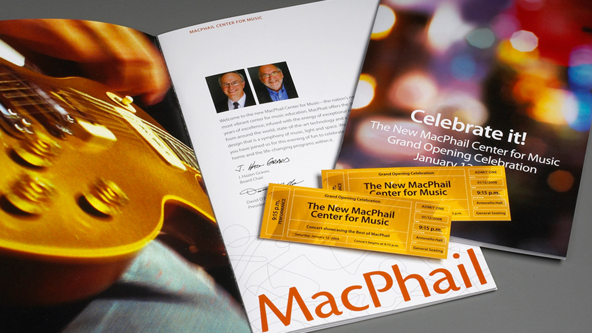
Drumroll, please. Using the gala invitation as a visual cue for the rest of the grand opening materials, unveiling of the new identity was saved for a week-long celebration.


