MacPhail Website Redesign

MacPhail website sings with the power of music.

MacPhail Center for Music is a highly regarded community music school with a 100 year history of high quality musical instruction. MacPhail leadership decided it was time to update its website to make it more current, reflecting its innovative offerings. User research showed an opportunity to greatly improve UX in navigating the site and being able to find and sign up for classes online.

Working with the marketing team and developer, we created an overall look that was an active, dynamic backdrop for the existing MacPhail visual identity. It is comprised of rich gradations of color, background patterns that animate across pages and extensive photos of students and teachers immersed in their musical expression of choice.

Website

Identity

Digital

Brand Strategy

decorative color bar

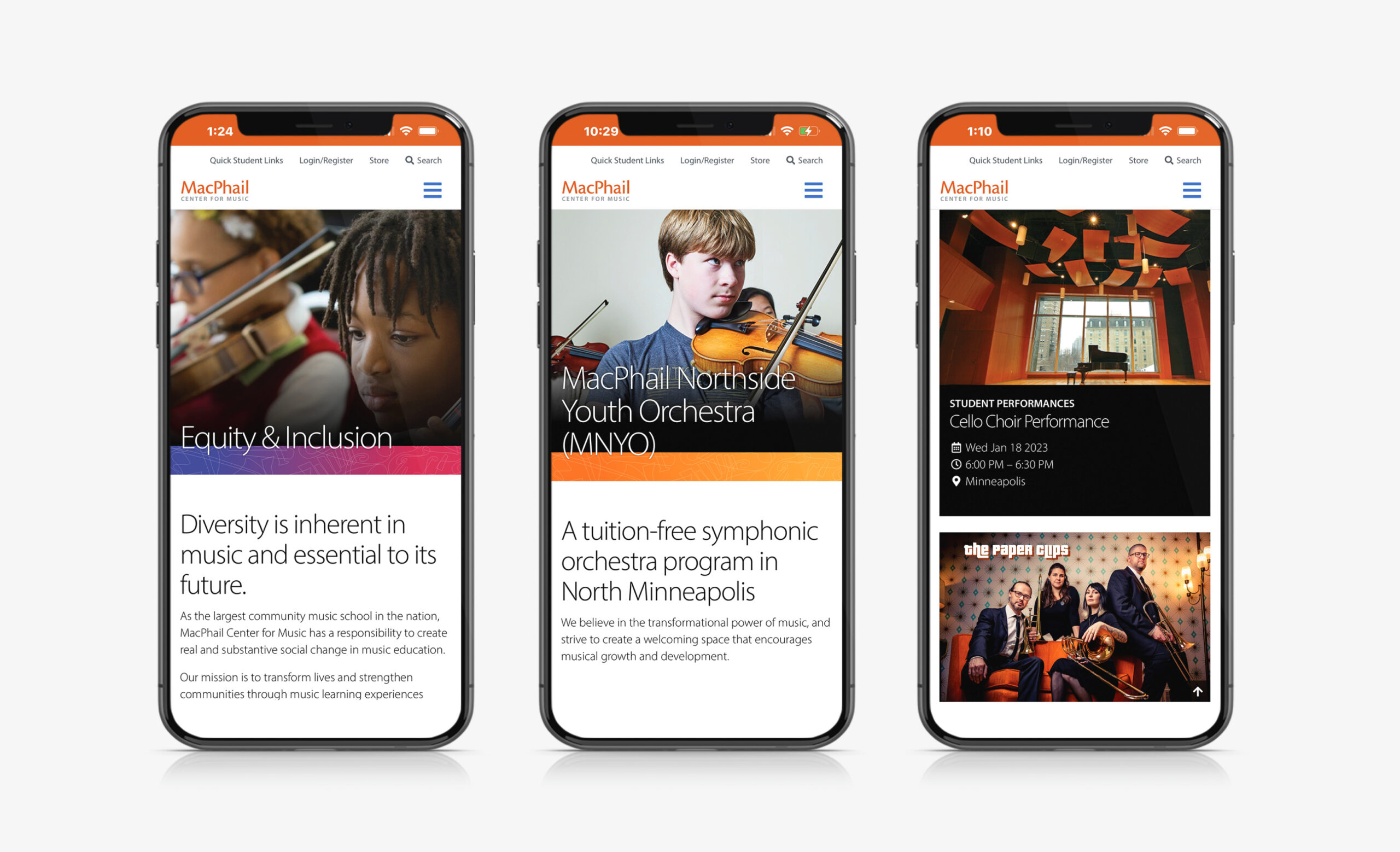
The combination of emotional imagery and vibrant color create an energetic identity that sets MacPhail apart from its competition.

The graphic music pattern is a distinctive and memorable design element that separates MacPhail from its competitors.

decorative color bar

The website was created to maximize the user experience on both desktop and mobile devices.
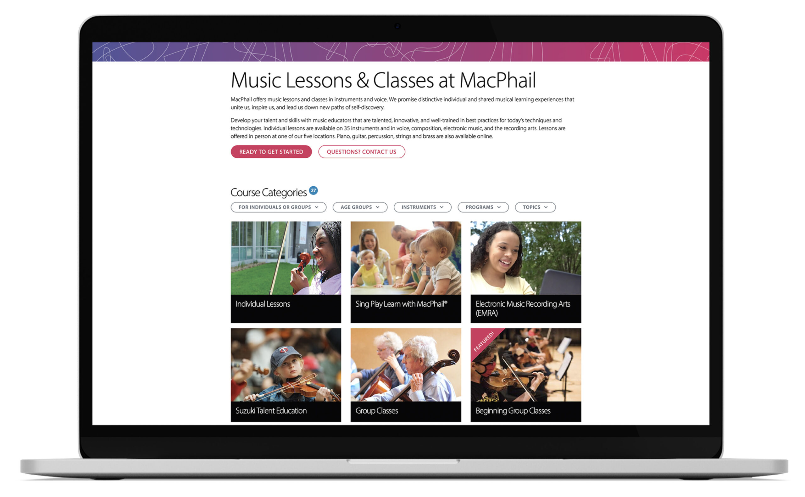
A simple grid format for browsing classes offers the ability to highlight specialty areas and new course offerings. Filtering makes it easy to find specific classes. And class listings now display detailed information while making it easy to register and pay online.
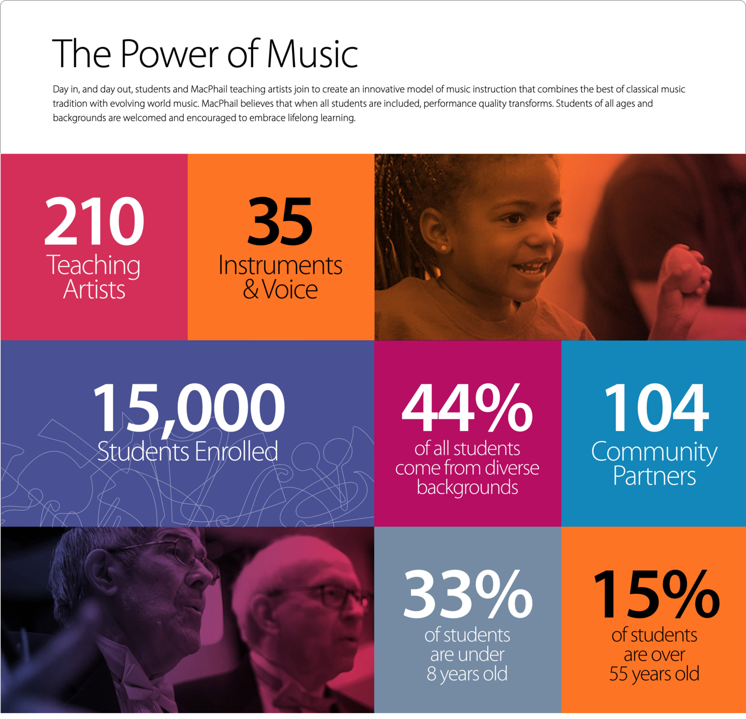
A templated grid format is used to show visual expressions of data in an interesting way.

This site uses cookies to enhance your experience.Privacy Policy.