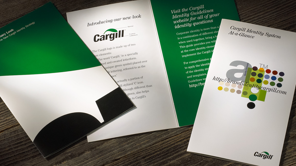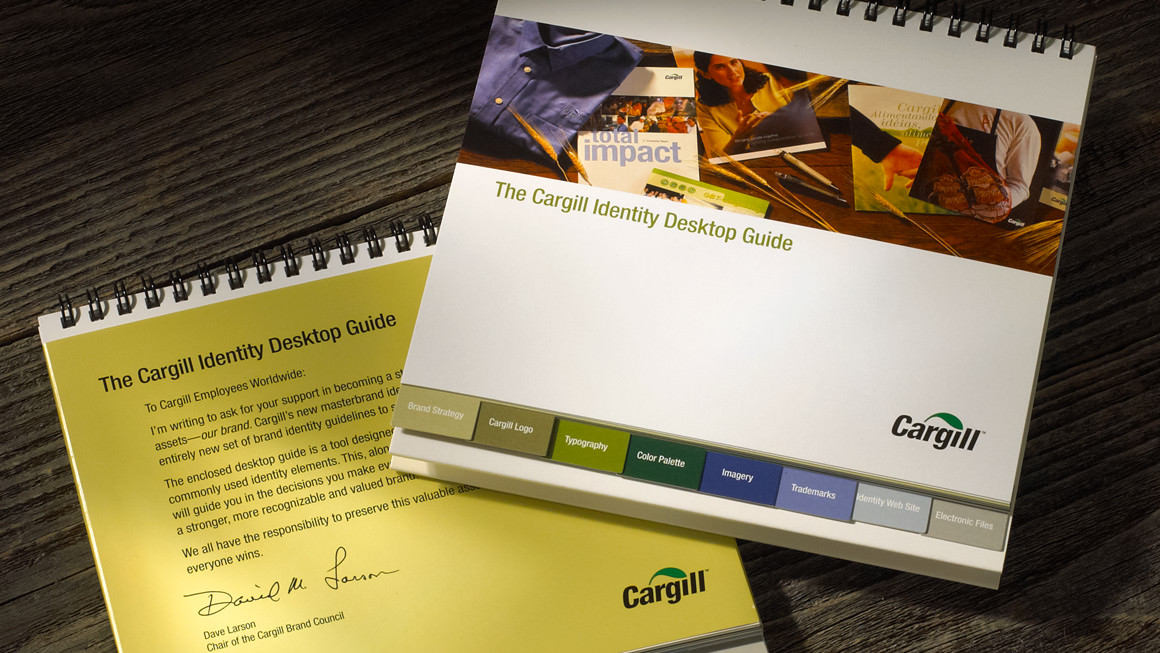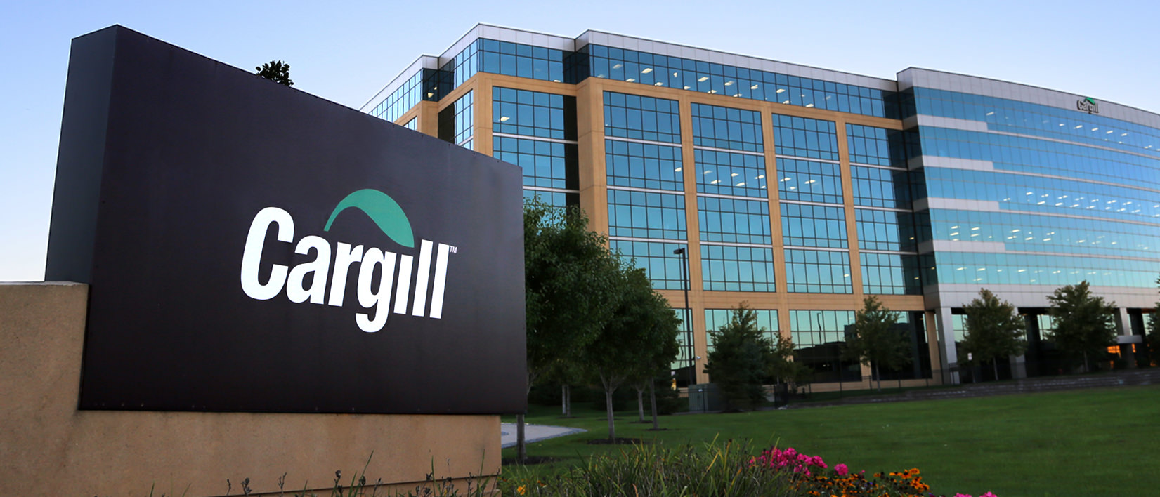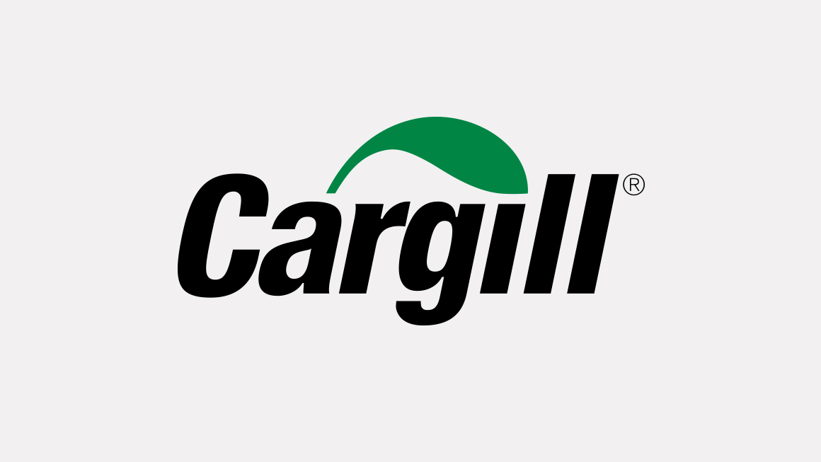
The Solution The redesigned logo preserves a visual link to Cargill’s legacy through the incorporation of a leaf shape. At the same time, it created a new look for Cargill that is dynamic and forward thinking. As part of the initial launch, Franke+Fiorella designed the stationery system and signage plus a robust online identity guidelines website complete with templates. A desktop reference guide and at-a-glance reference tool were also developed to assist employees in adopting the system.
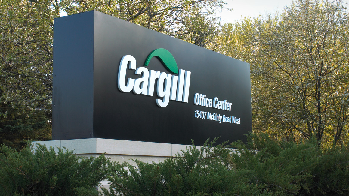
The Result Cargill’s new logo and brand identity system were key components in strengthening the Cargill brand—helping the company grow from $50 billion in revenues in 2001 to $119 billion in 2011.
