Visual Identity Systems: Why Your Brand Identity Needs More Than a Logo
A visual identity system is a critical investment in your brand to build familiarity and recognition. You might be thinking, “What is it exactly, and why do I need one? Isn’t our logo enough?” Comprised of a color palette, typography, imagery—from photography to illustration—grids and graphics, a visual identity system gives your audiences cues to associate with your brand beyond the logo.
We’ve been part of numerous conversations where people say their logo needs to tell their brand story. While this is true to a certain extent, we always pause because a logo must express the essence of a brand, but to expect that a logo alone will convey everything about a brand is unrealistic. Why? From our perspective, there are five key reasons:
1. Differentiation between logo symbols is becoming increasingly more challenging. As brands proliferate and designers are exposed to cultural and design trends around the world, they are bound to influence each other. You’ve probably seen articles showing similarities between logos for prominent brands. If not, here are just a few:


A truly differentiated mark, based on the brand strategy, should always be the goal. But the reality is that as the world grows smaller and more accessible and people are exposed to a plethora of brands and cultures, the visual noise intensifies. The result is that developing an icon that is completely unique becomes even more challenging.
2. Shrinking display space. Today, key brand touch points don’t always allow for a full logo to be viewed. Take social and app icons, for instance. They may be the most ubiquitous visual representation of a brand, yet they are often the smallest, and most logos won’t fit within them. But we still have color, typography and graphics to help convey the brand essence.
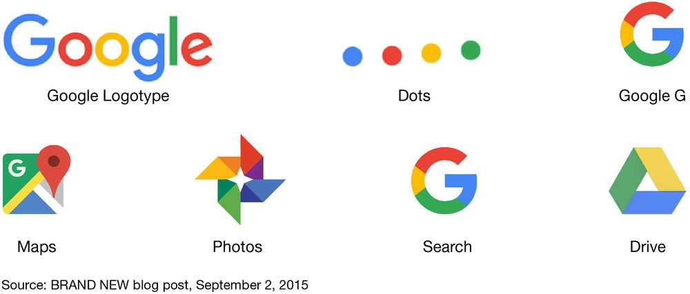
If we look at Google’s recent redesign, the logo is only one part of its overall identity. As you can see from the images below — color, flat graphic styling and geometric shapes play an important role in connecting users with the Google brand experience, no matter what path of interaction they take, or how small the icon.

3. Brand impressions are the sum of multiple interactions through multi-sensory experiences. As human beings, we are multi-sensory processors of information, all of which influences how we perceive our worlds. In addition to a brand’s logo, there are the elements of photography, illustration, typography, graphics and animation. And in the physical world, we go beyond the visual to engage the other senses including tone-of-voice, sound, smell, taste and touch.
Intel’s operating system chime and MGM’s roaring lion are examples of longstanding trademarked sounds. And as of October 2015, the U.S. Patent and Trademark Office had 10 active registered scent trademarks on file—the most notable being the “flowery musk scent” in Verizon’s flagship stores. All of these things, when woven together, help to convey what a brand stands for and influence how people experience and perceive it.
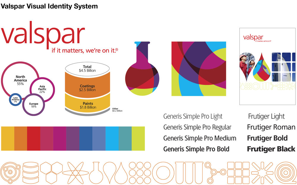
4. Brands are fluid. A logo should remain stable over time only being redesigned when the business demands change or there is a strategic shift. The visual identity, however, is a different story. A visual identity can (and should) evolve to change the experience and visual vocabulary of the brand as needed, while the logo remains the same. A number of organizations have done this recently to reframe the overall brand experience. Valspar (shown below) is just one example.

5. Identity systems help build consistency and brand recognition. The most effective visual identity systems are recognizable even without the logo. They help bring order to complexity, differentiate offerings, establish hierarchy and allow for more layering of brand expression.
Visual identity systems are powerful tools that help tell your brand’s story in a unique way. They let brands flex with the times without investing in a full corporate identity redesign.


